Over the summer I’ve been working upgrading NetKernel’s Visualizer ready for a major new release planned for the autumn/fall. All this work combined with comments from various folks set me thinking that not much has been said about this critical tool which must appear so alien on first approach.
The Visualizer technology was developed along side the NetKernel 4 kernel in the summer of 2007. After earlier experiments with more traditional breakpoint based approaches to debugging we realized that the ROC abstraction was at just the right level to allow a much more powerful debugger to be implemented. In a nutshell the difference between the visualizer and a regular debugger is that the visualizer captures everything that happens over a period of time rather than simply showing the instantaneous state at the time the breakpoint is activated.
Capturing everything probably sounds crazy/impossible right? But when you consider the pervasive immutability of state in Resource Oriented Computing (ROC) it starts to sound feasible and that combined with the naturally more granular approach that ROC encourages over object oriented and functional approaches I hope you see that it is indeed possible! (If your still not convinced then download NetKernel now and give it a try - it’ll take you less than 5 minutes to get it up and running.) What’s more, capturing visualizer traces have close to zero performance overhead to an executing system. Again this is due to the immutability of state - capturing simply involves hanging on to state for longer than it otherwise would be - so, yes, this does take extra heap space.
The real win with the visualizer is that the trepidation of overstepping the unknown critical line of code is gone. No more spending lots of time elaborately setting up some situation and carefully stepping through it in the debugger only to find that you were a bit zealous with that step-over button or you realize you realize that what you’ve just spend and hour tracking down was a symptom and not the cause. So maybe the physicists can’t pull off time travel, but you can with the help of the visualizer. Time machine debugging really means stepping back in time as well as forward. I really find it hard going back to a regular debugger.
Other benefits of the visualizer include:
Realtime profiling - with NetKernel Enterprise Edition all timings are captured so local and elapsed times of all requests are captured and can be explored to look for hotspots.
Testing - visualizer traces can be programmatically captured and introspected enabling rich testing of not just what but how and why.
Modeling - capturing the full details of how requests are processed can lead to some interesting visualisations!
Support - Visualizer traces can be saved and re-loaded aiding rapid remote support and all the necessary information for bug fixing.
Evaluation happens in real-time - so their are no “heisenberg effects” and debugging happens after the fact at your leisure.
Visualizer Walkthrough
Let’s have a look at some of the key aspects of the implementation. In a later post I’ll maybe go into more detail if there is interest. I’m going to show the new version - the core concepts and layout remain unchanged. The main differences are in refinement of the UI and new extended views and tools.
First step is to enable the visualizer and capture some traces. The main page lets you do this as well as manage the traces you have captured:
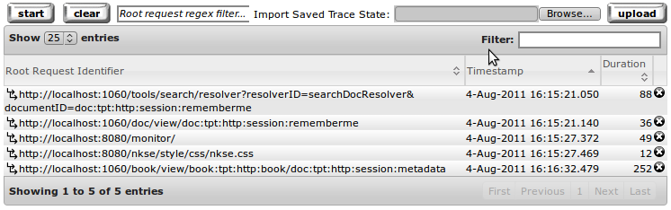 Figure 1: Table of captured request traces
Clicking the start button will start the capturing of traces, clicking it again will stop. Each entry in the table is one captured trace which corresponds to the full execution state of one root request (an external event/request injected into NetKernel through a transport) from start to end. You have the option to capture all requests or specify a regular expression filter on the root request identifier, so for example only capture requests from a particular transport or to a particular application.
It is worth stating here, for those less familiar with ROC, that the root request usually initiates sub-requests and those sub-requests initiate further sub-requests down to arbitrary depths into your application. The resource oriented approach isn’t just surface deep. It is this tree of sub-requests that form the captured trace.

Clicking on one of the captured traces we get a context menu with a choice of actions to perform. If we select “View Request Trace” we can drill down into the details of what happened during the execution. (One of the changes that has recently been implemented is full integration with NetKernel’s Space Explorer. Not only does this give full cross-linking of entities such as spaces and endpoints but also allows the extensible action framework that provides these context menus.)
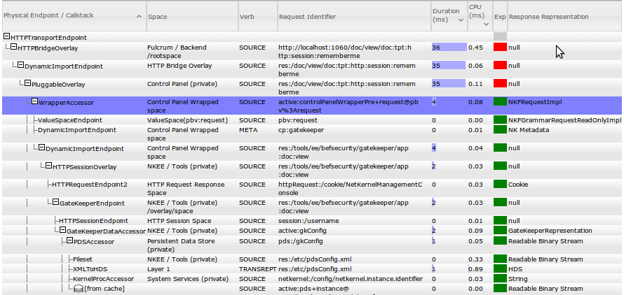 Figure 2: View of request trace showing recursive tree of sub-requests
Once we get into the details of the request trace you can begin to see how the visualizer approach is different. The table here shows the full recursive request execution tree laid out not just the current call stack. A call stack view (from the perspective of a particular sub-request) is available as are various other views. Each row represents one sub-request, the endpoint that handles it and the response returned. The columns in the request trace view are:
- The call tree with the endpoints that are invoked for each request.
- The address space which hosts the endpoint
- The request verb
- The request identifier
- The elapsed duration of processing the request
- The local time spent inside the endpoint not including sub-requests
- Expiration status of response
- Representation of response
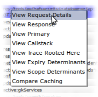
Clicking one of the request rows presents a context menu. For the moment we are going to click “View Request Details” and see all the gory details of a single sub-request. The request details view is broken down into several sections which show the issued request, how it was resolved, how the endpoint processed the request (if any, often processing as cached), and finally the response.
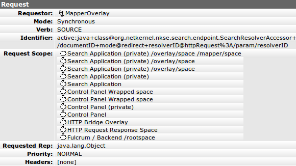 Figure 3: Request Details
I don’t want to go into any discussion here about each of the displayed fields. The point I want to make is that all the details are there captured.
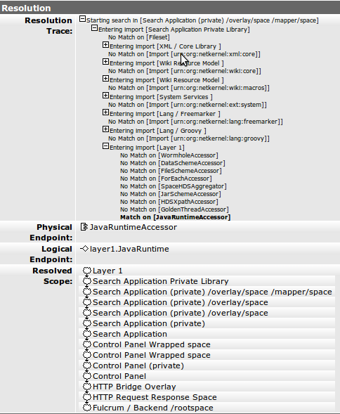 Figure 4: Resolution Details
The resolution process is mechanism that the NetKernel kernel uses to locate an endpoint to evaluate a request. The detail here shows how the request scope is systematically interrogated until a resolution is found. If a match is found the endpoint is then used for evaluation. For more details on the scope concept see my earlier post on Dynamic Resolution.
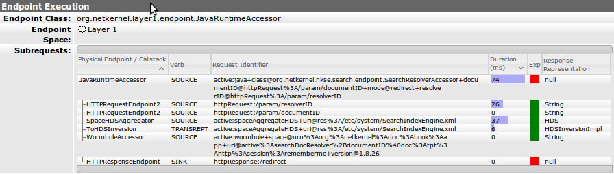 Figure 5: Endpoint evaluation details
The endpoint details section is only shown if the endpoint is evaluated. Often times
the response can be pulled from cache. Details of any direct sub-requests issued are
shown along with their expiration and duration, both useful for determining correct
and efficient operation.
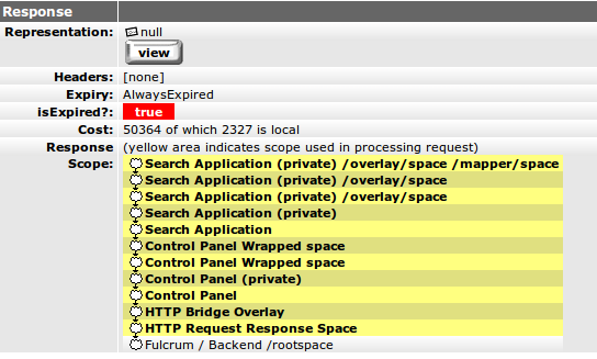 Figure 6: Response details
Again all the details of response are here. Nothing is hidden.
I hope this post gives a good overview of the visualizer. I plan to talk in more detail at a later stage about some of the new views that we’ll be releasing soon and what has motivated them. In writing this post I notice there are a lot of details of the NetKernel implementation of ROC that are not really talked about elsewhere, for example, what does cost on the response mean? what does the expiry field really show? Let me know if there are other dark corners you would like me to shed light on.